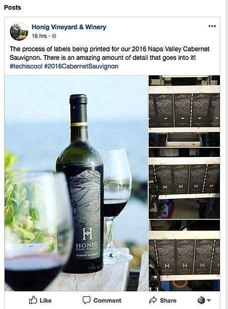
08 Jun “There is an amazing amount of detail that goes into it!”
Regina Weinstein, Hoing’s Director of Marketing, has posted many Facebook stories that have caught my attention. This one instantly hooked me.
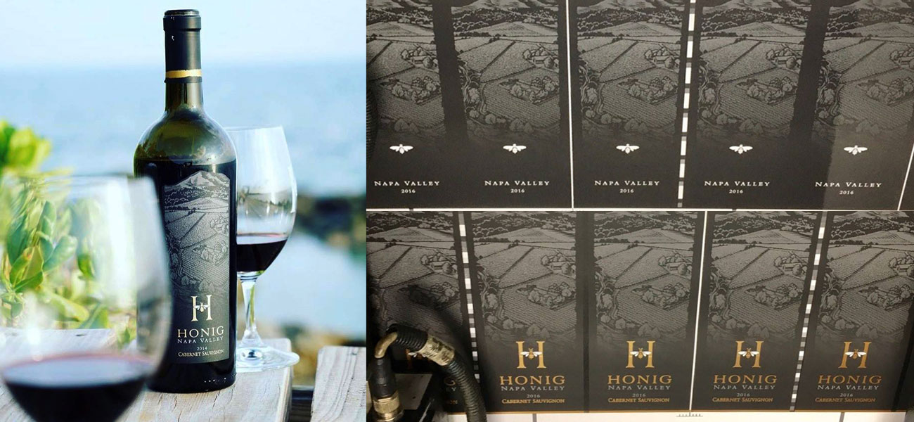
Regina’s post included images of their Cabernet Sauvignon label on press. I couldn’t agree with her more, there is an amazing amount of detail that goes into capturing every detail in their labels. So much so that it might put some people to sleep.
 It Didn’t Put Me To Sleep!
Regina’s post was referring to the printing process. That’s where everything comes together and you get to see if all your objectives and visualizations for an approved design end-up on paper and on the bottle. That last part, “on the bottle” is most important. Sometimes, your expectations can exceed what is possible in the real world of printing.
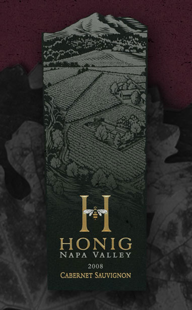
For those of us involved in meeting or exceeding visual expectations, the press check can be both rewarding and a little unnerving. Adjustments are made on the fly. Color and ink values are tinkered with, embossing depths are enhanced and foils are noodled and tweaked. All of these activities are even more acute when there are subtle effects that need to be reproduced. Honig’s Cab labels had more than a few; like the bottom third of the label that transitioned to black. Achieving that effect on press was tricky.
Designer In The Shooting Barrel!
Every designer has stories that they will never forget. One of my memorable moments centers on the meeting when this label was created. We were well into the design process and the time had come to present to the Honig management team. Up to that point it had been up to Regina and I. For reasons I will never fully understand, I volunteered to haul my giant Mac Pro computer and 30 in. display up to Honig’s conference room in Rutherford. The plan was to present all the new designs on-screen and invite feedback.
I was expecting three or four people at this meeting. I was wrong – we drew a small crowd. Everyone, it seemed, wanted to see our wide screen presentation. Once it became clear how easily changes and enhancements took place, a whole new world opened up for incoming suggestions.
Michael Honig Had A Few Calls!
When the time came to focus on the Cab label Michael Honig, Honig Vineyards’ President, suggested a few alternatives. He wanted to see the vineyard illustration without a sky. Then we focused on the bottom of the label. We moved the Honig icon around. There were suggestions to create a strip label below the vineyard illustration. Then I had an idea to create a gradient screen that faded to black. This gave us the perfect amount of contrast for the label’s other visual elements – all of this nested inside the label itself. The approach worked particularly well because the tapered Bordeaux bottle was essentially black when filled with wine. There was instant approval all around. The Cab label was done.
The Designer Was A Train Wreck!
Once I loaded all the computer gear back in my vehicle and got behind the wheel I sat there for a while. I felt like I had been on the floor of the New York Stock Exchange on an epic trading day. The upside was that we had reached a consensus on all the label designs. Other than a few adjustments Regina and I made at a later date, the labels did not change from that marathon meeting.
As Regina mentioned in the above headline, “There is an amazing amount of detail that goes into it!”