16 Feb I Saw a Zebra on a Bike Ride . . .
Northern California has very few zebra sightings. I think you would have to peddle by a zoo. That said, I saw one. Visions like this are common when I am onboard my bike. I see all sorts of stuff. Hopefully, enough of my attention span remains focused on the road in front of me.
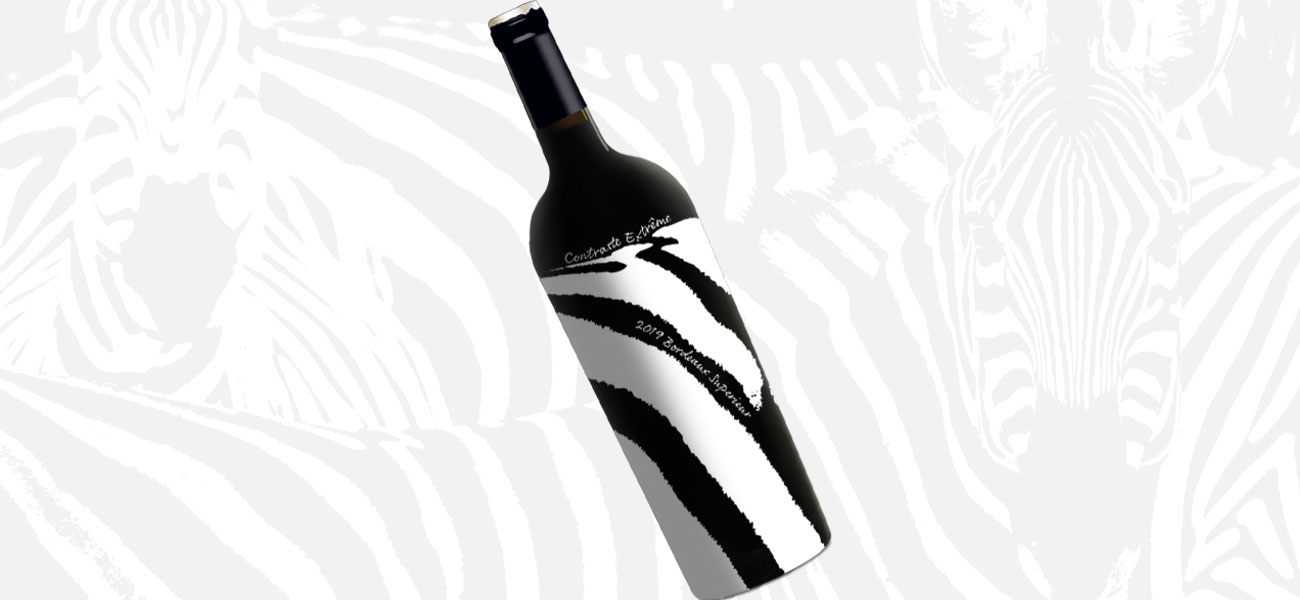
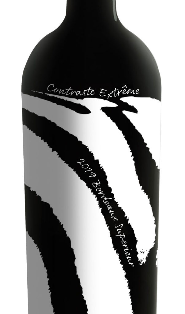
 Contraste Extrême Appeared Out of Nowhere!
Capturing attention is the first and foremost task of every wine label package. If your brand is invisible on the shelf, you have failed. Like my imaginary zebra sighting, seeing a zebra on a retailer’s shelf is an even rarer event. That’s what motivated me to see what it might look like.
Once I got the design worked out I needed a fancy name. Anything French usually elevates a brand and tends to add value to a price point. Contraste Extrême seemed like a natural. Nothing in nature has more contrast than a zebra.
Make It Real.
Ideas are of no use to anyone if they can’t be executed. Contraste Extrême would be a perfect silk-screen package. It could be a white pigment value on a Bordeaux bottle. The design could wrap around to the back side to enhance the back label.
Who Wants It?
All I need now is a brave client who appreciates a new distinctive look and an eye for the unusual. I know they are out there. Two of my self-promotion designs made the leap from hypothetical to real on-the-shelf brands. Click my contact link and we’ll make it happen.
