25 Jan A Brush With Brushstrokes!
Brent Shortridge and I go back decades when he was the Marketing Director for the Napa Valley Vintners. His attention to detail has remained constant to this day.
Expressing Premium Red & White Blend Wines
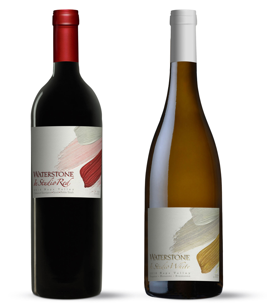
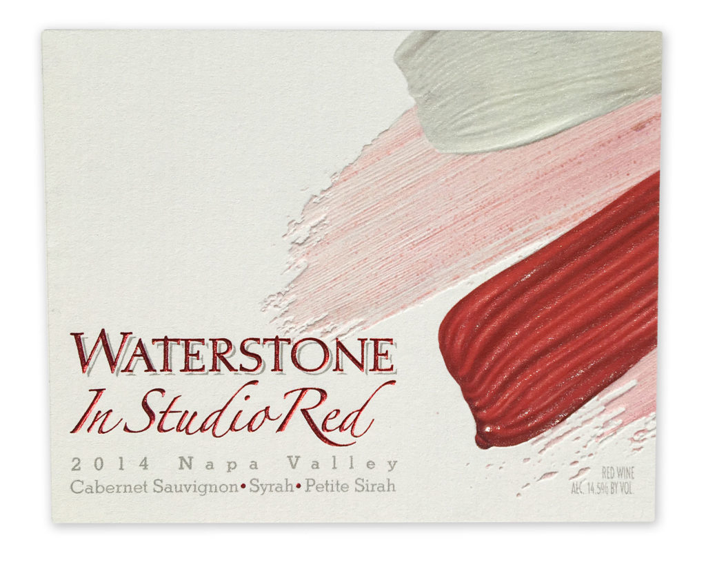
When he asked me to create the packaging for a new premium tier for his Waterstone brand, detail was going to be the defining point. We carried over the Waterstone letter forms and the general look and feel of the standing brand. The new name, “In-Studio” was the visual trigger. I needed to find a striking visual that would support the name and suggest the marriage of the varietal blends in the bottles.
Highly detailed brush strokes seemed to capture what we were looking for. Creating these strokes on two dimensional paper was only starting point. I wanted to see these strokes in 3D. I also wanted to add texture and reflection. Each stroke of paint needed to look real.
 Printing Is Not Enough:
Creating dimension and reflective characteristics can only be achieved with multi-level embossing, foil treatments and gloss varnish coatings. Ink on paper can only do so much to put across an idea. Thanks to the highly skilled professionals at All American Label in Dublin, CA, each treatment elevated the design and expressed the quality level we where looking for. The brush strokes looked like they were still wet paint, thanks to the high gloss varnish pass. All of these effects did their part to support the price point of the wine in the bottle.
Being There:
Both Brent Shortridge and I tracked each step of the way at the press check. Each special effect was monitored and adjusted – more compression on the embossing pass, registration bumps on the foils and gloss values on the varnish passes. Each one of these on-press moves did there part to raise the quality of the whole. All American Label nailed it. We couldn’t have been more pleased.