13 Mar Attn: Gardeners – Look for Me In Your Potting Shed!
Last year I got a call from John Dimmick, the owner and inventor of Maxsea micronutrients. For those in the know, Maxsea is highly regarded seaweed plant food. Maxsea’s three formulas are prized by gardeners across the county and enjoy a premium reputation in nurseries from coast to coast.
 An Entirely New Look!
John and his wife Michelle were drawn to my website because of my wine packaging background. They were looking for an entirely new look for Maxsea’s product line. For me, it was a new product category and canvas. It’s always exciting to explore new terrain and see what happens.
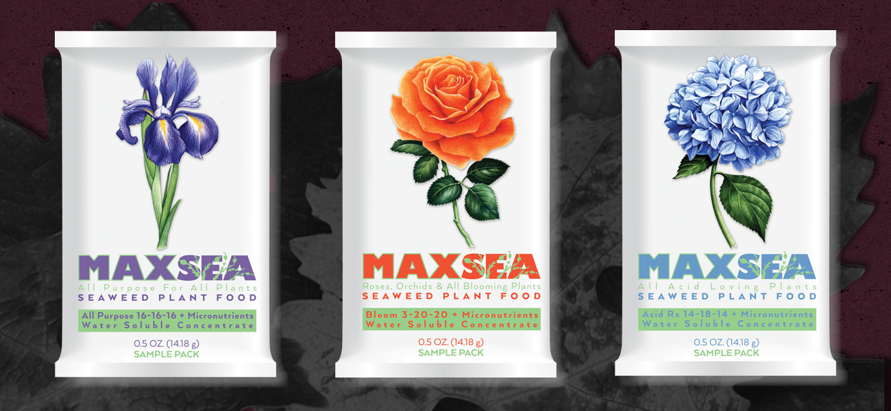
Since John and Michelle’s product line already had a strong following, it was important to evaluate their standing package design. We all agreed that each package was cluttered and dated. Clutter, as a general rule, obscures legibility and clarity. In my opinion, the original flower illustrations were flat and lifeless. I proposed new illustrations with vibrant color. Since Maxsea’s core objective is to restore life and vitality to their customer’s gardens, let’s step on the color.
Vitality Equals Color!
I turned to my friend/illustrator Tom Hennessy. Tom never needs much encouragement in the color/vitality area. All of these things flow out of him and end up capturing attention on my design projects. He didn’t disappoint us with Maxsea’s new iris, rose and hydrangea. Each flower was electric and eye popping. Both John and Michelle Dimmick shared my enthusiasm.
I know a keeper when I see one. In this case I had three. I decided to present each Maxsea product category as cleanly as possible. I wanted each flower to connect with the consumer. Any heavy handed design treatment would get in the way. When I presented the new design John and Michelle agreed.
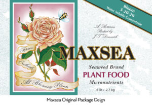
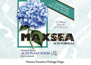 A Bridge Design Treatment
After showing the new designs to wholesalers and large nursery clientele, there was concern that we were walking away from established brand identity. John suggested a half way measure that would transition Maxsea customers from their old branding. We nested the new flower illustrations in the original layout elements and removed some of the clutter. Our strategy was to ease into the contemporary look and feel by the end of year.
Maxsea’s has certainly complemented the designs in my garden. It never occurred to me that I would be putting my skills to work in an outdoor landscape. It has been fun and I look forward to rolling out the entire Maxsea product line.