Obviously, projects presented on this website represent the kind of work that best reflect my capabilities. Some assignments scaled differently than others. Many of the designs have enjoyed (and continue to enjoy) long shelf lives. Many of them have received recognition for outstanding design achievement.
“Other Moon Landings” capture presented and approved designs. However, not all designs make it. Some concepts are rejected. That’s all a part of the process. Clients, after all, are entitled to a look and feel that resonates with them. Take a look at some of my favorite presentations that stayed in the drawer. Some of these ideas morphed into self-promotion concepts.
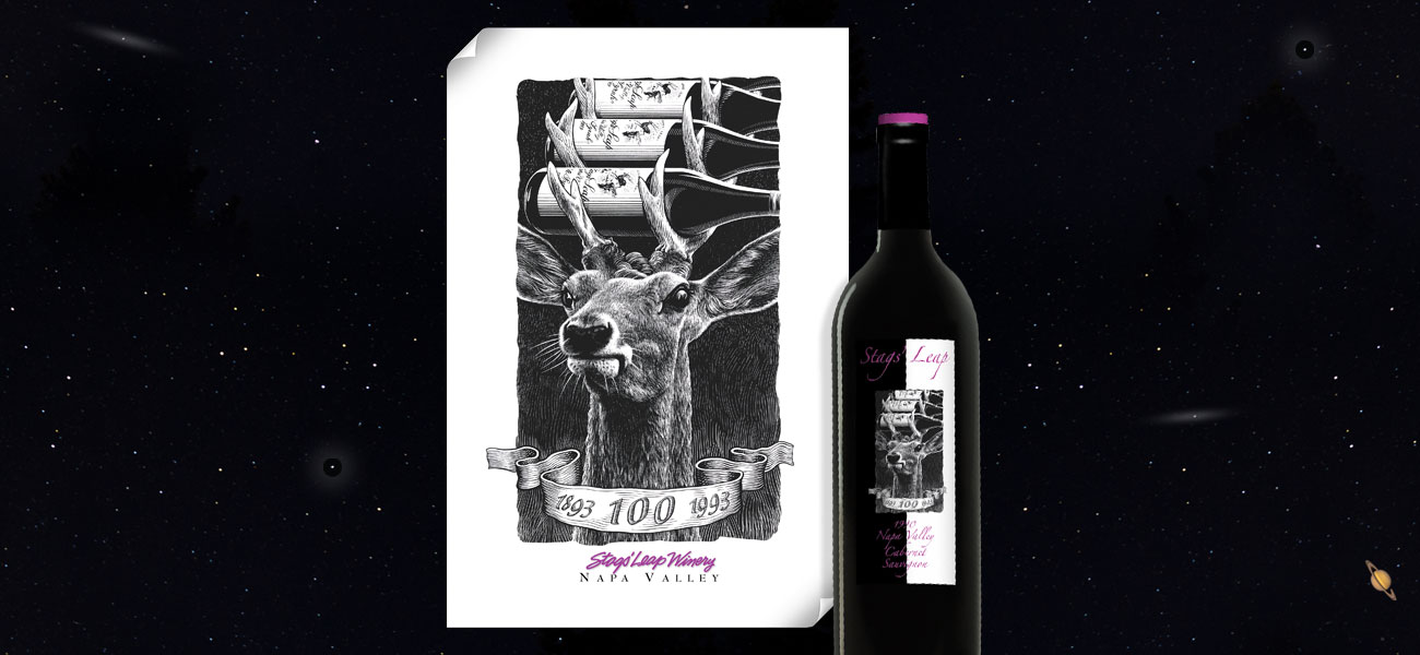
Stags’ Leap Winery:
Carl Doumani had high name recognition in the Napa Valley in the 1990’s. Carl was the owner of Stags’ Leap Winery in the Stag’s Leap Appellation. I was fortunate to have been awarded all the graphic communication requirements for a year long commemoration of the Winery’s century mark. The assignment included an icon and a long list of marketing communication requirements. The deer and “wine rack” concept was all over the Napa Valley and made a very positive impression. It also reflected Carl Doumani’s abundant sense of humor.
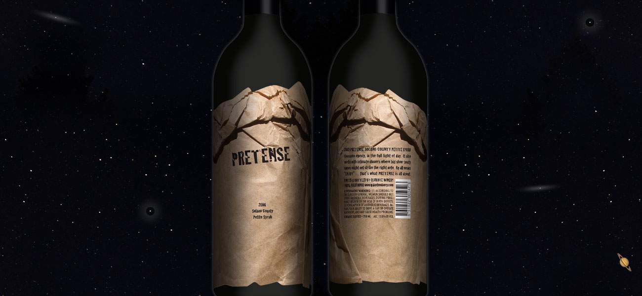
Pretense Petite Syrah:
Another Carl Doumani project that captured his sense of humor and perspective on the wine industry. The package was a full wrap label to give the appearance of a brown paper bag. The brand name “Pretense” flipped the paper bag vibe back on its self. Carl was first in line to be provocative and this design expressed it.
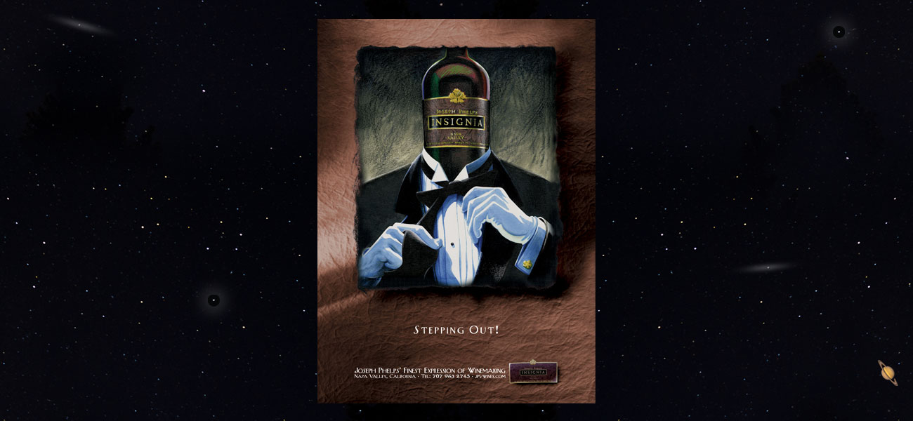
Joseph Phelps Vineyards:
I met the late Tom Shelton, the CEO of Joseph Phelps Vineyards, when I was rolling out the graphic requirements for the Napa Valley Vintners world wide marketing tours. Tom asked me if I would be interested in creating an ad campaign for Joseph Phelps. The result was an award winning series of ads in “Wine Spectator” and other industry publications. Joseph Phelps Vineyards remained a client for years. The ad and poster for Phelps’ Insignia brand won a national Addy Award.
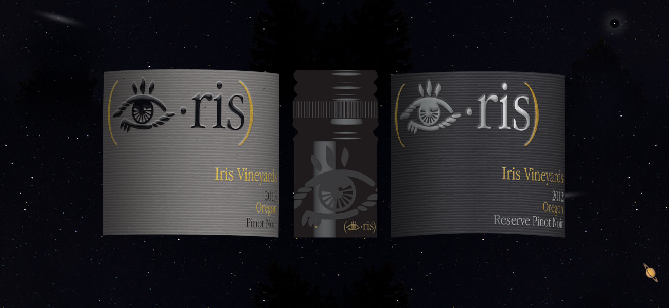
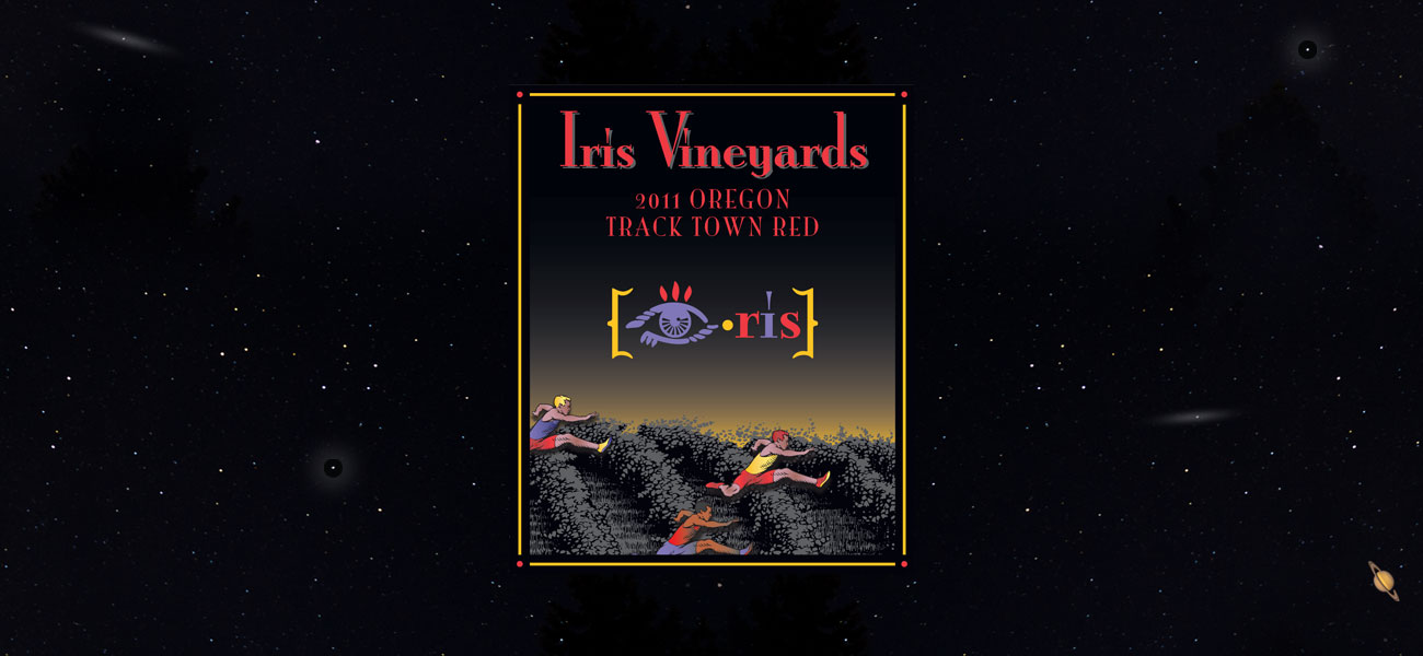
Iris Vineyards:
Thanks to my long standing relationship with Benton-Lane Winery, in the Willamette Valley, I met Mike Lambert, who was B-L’s President. Years later Mike moved to Iris Vineyards in the Oregon wine growing region. Mike and I rebranded Iris’ packaging and upgraded the look and feel of their portfolio.
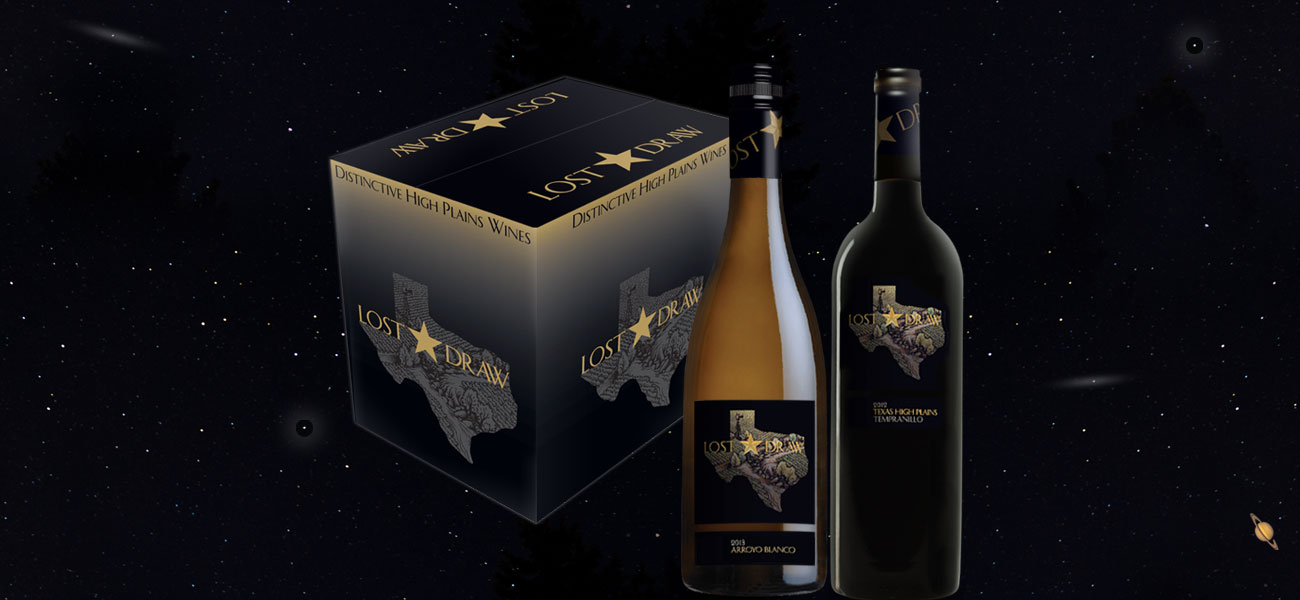
Lost Draw Cellars:
The assignment started with the brand name. There were a number of western leaning handles but “Lost Draw” was my favorite. It worked with the Texas scene, it was only two words and it was memorable. The look and feel of the packaging reflected Texas and the higher premium category that “Lost Draw” was looking for.
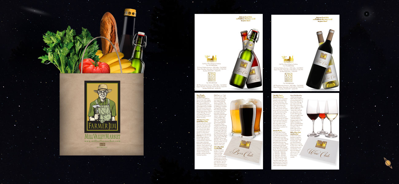
Mill Valley Market:
Mill Valley, California is, without exaggeration, a central casting expression of a small town. At the center of the town is a family grocery store that has served the community for four generations. It has been a privilege to work with the Canepa Family to create everything from their logo, website, ad campaigns and recently, pamphlets for their respected and well known wine and beer clubs.
Glazer Family Estate Wine Division, Dallas, Texas:
Glazer is one of the country’s largest wine and spirits distributors. My next door neighbor, Bill Casico, just happened to be Glazer’s new wine country ambassador. He asked me to design their new corporate identity graphics to reflect Glazer’s presence in the Napa / Sonoma wine growing regions.
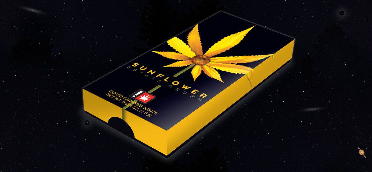
Sunflower Cannabis Packaging:
My former Iris Vineyards and Benton-Lane Winery client, Mike Lambert, became the marketing director for Wild West Growers, Oregon’s largest cannabis cultivator. Mike’s objective was to move marijuana away from the Grateful Dead look and feel. He focused his premium wine marketing skills on upgrading the image of the industry by elevating the branding. Sunflower was the first new package design to reflect Mike’s objectives.
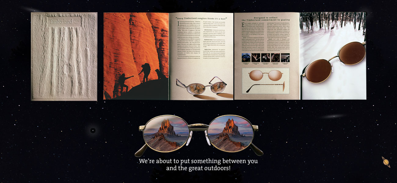
Timberland Eyewear:
Timberland Eyewear was my first start-up experience. An entire business; from product design, manufacturing and marketing was created and executed on a very short timeline. Everything was driven by the industry’s annual winter marketing events; an optical show in Europe and at Outdoor Retailer in Salt Lake City. All product, packaging and promotional materials had to launch to meet these deadlines. My responsibilities included every single piece of marketing communication from company launch announcements to catalogs and everything in between.
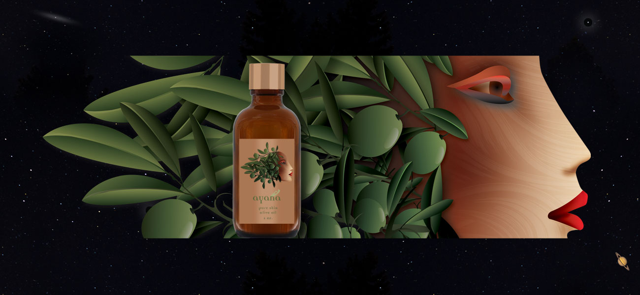
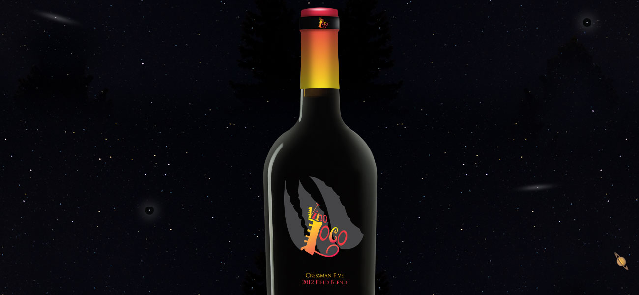
Farm Diva & Ayana Pure Skin Olive Oil & Vino Loco Package Designs:
Mill Valley local and entrepreneur Victoria Cressman asked me to design her skin care packaging. A yoga look and feel was suggested. This is where we landed. Victoria and Dan Cressman also commissioned me to design their Sonoma red wine blend “Vino Loco” branding.
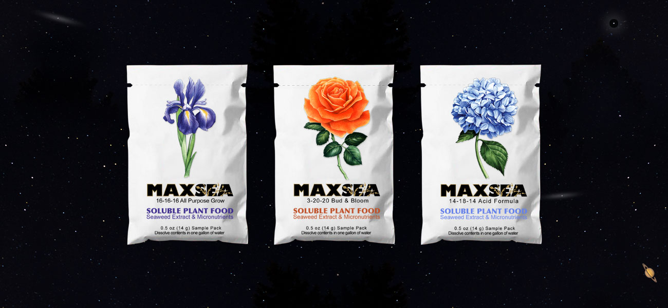
Maxsea Seaweed Micro Nutrients Package Design:
John and Michelle Dimmick asked me to design and execute a new look and feel for their national brand of plant supplements. The new design would be expressed on their entire product line. Maxsea is a premium plant supplement and highly prized by the gardening community. JT Dimmick, Garberville, California.
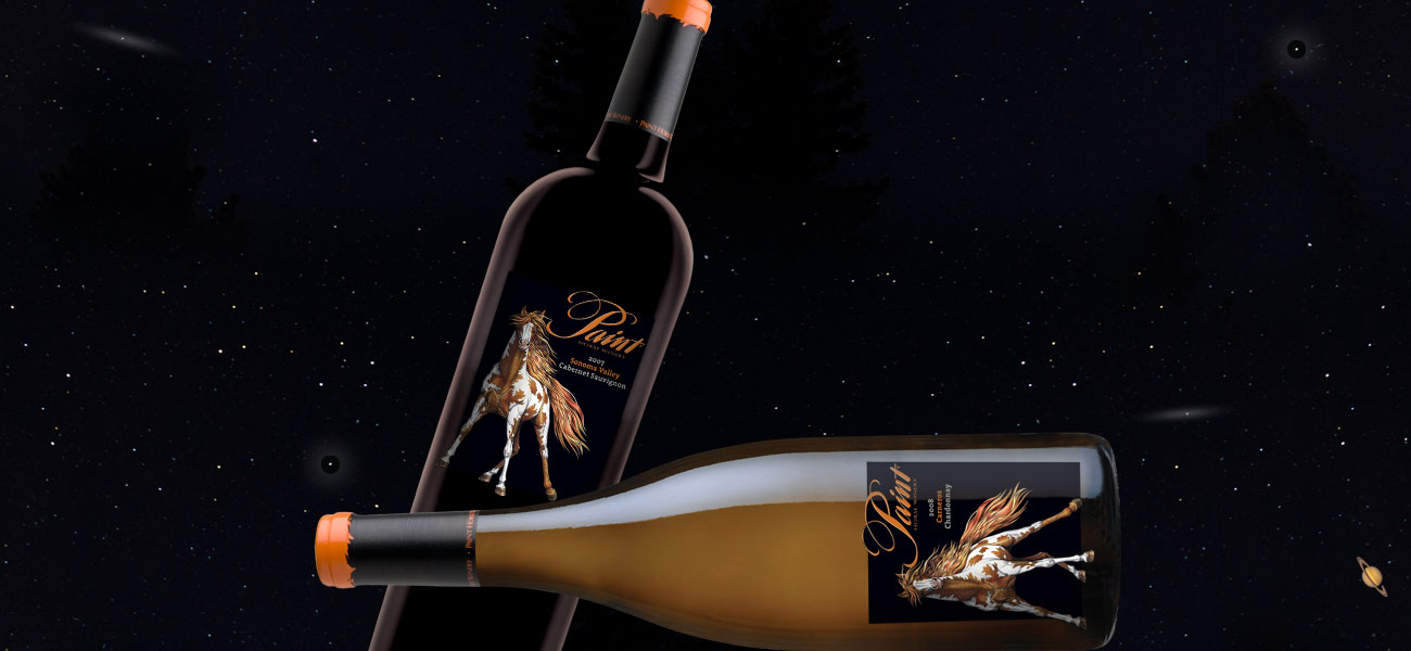
Paint Horse Winery:
Bruce and Liz Green’s vineyard in Glen Ellen (Sonoma Valley) had long produced Cabernet Sauvignon fruit. They decided to make the move from growers to vintners and create a brand that reflected their own passions for both wine and horses. Specifically, Paint Horses. We focused on the best possible rendering of a Paint Horse and built the label around it. Thanks to illustrator Tom Hennessy for capturing exactly what Liz and Bruce were looking for.
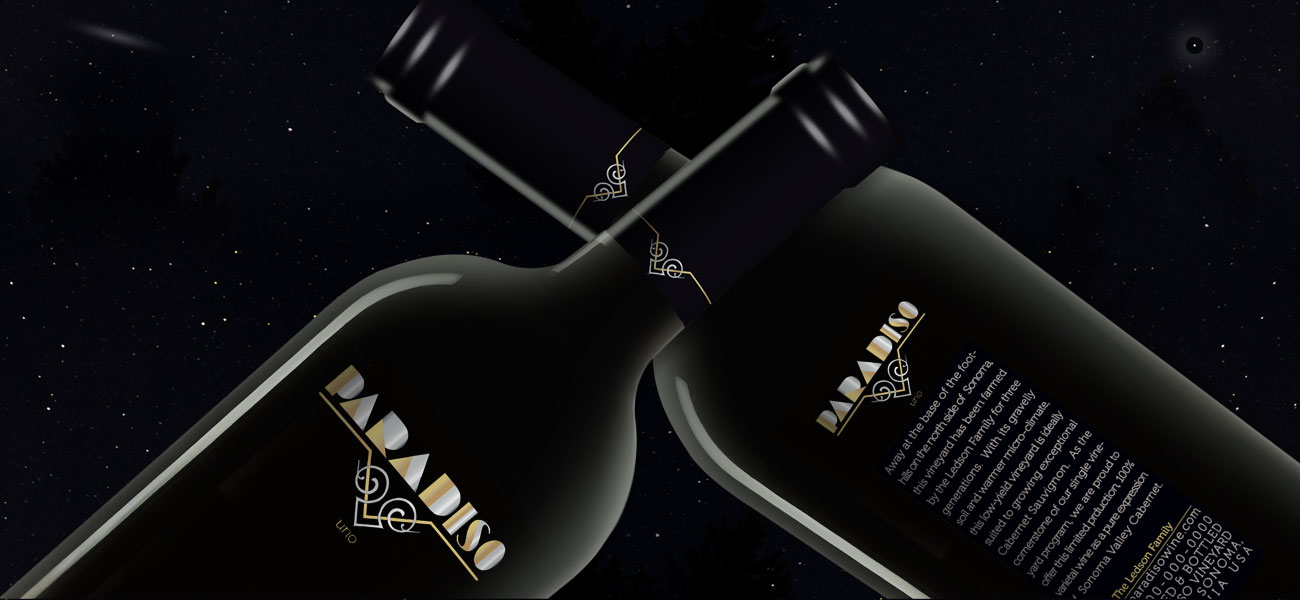
Paradiso:
This was an ultra premium red blend project for Ledson Vineyards in Kenwood, Sonoma Valley. This silk-screen package (with gold and silver foil) made it into production. Unfortunately, there was a trademark dispute with the Paradiso name and it never made it to market. I still like the clean elegance of type treatment and line work which, in my opinion, reflected the wine’s ultra premium price point.
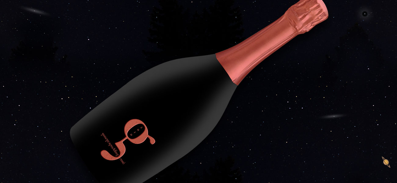
George Sparkling Rosé:
I have never designed a sparkling wine package. I got tired of waiting around and came up with “g.” It started with my love for the font, Democratica. It’s very old world and extremely elegant, in my opinion. Other graphic elements nested around the font treatment.
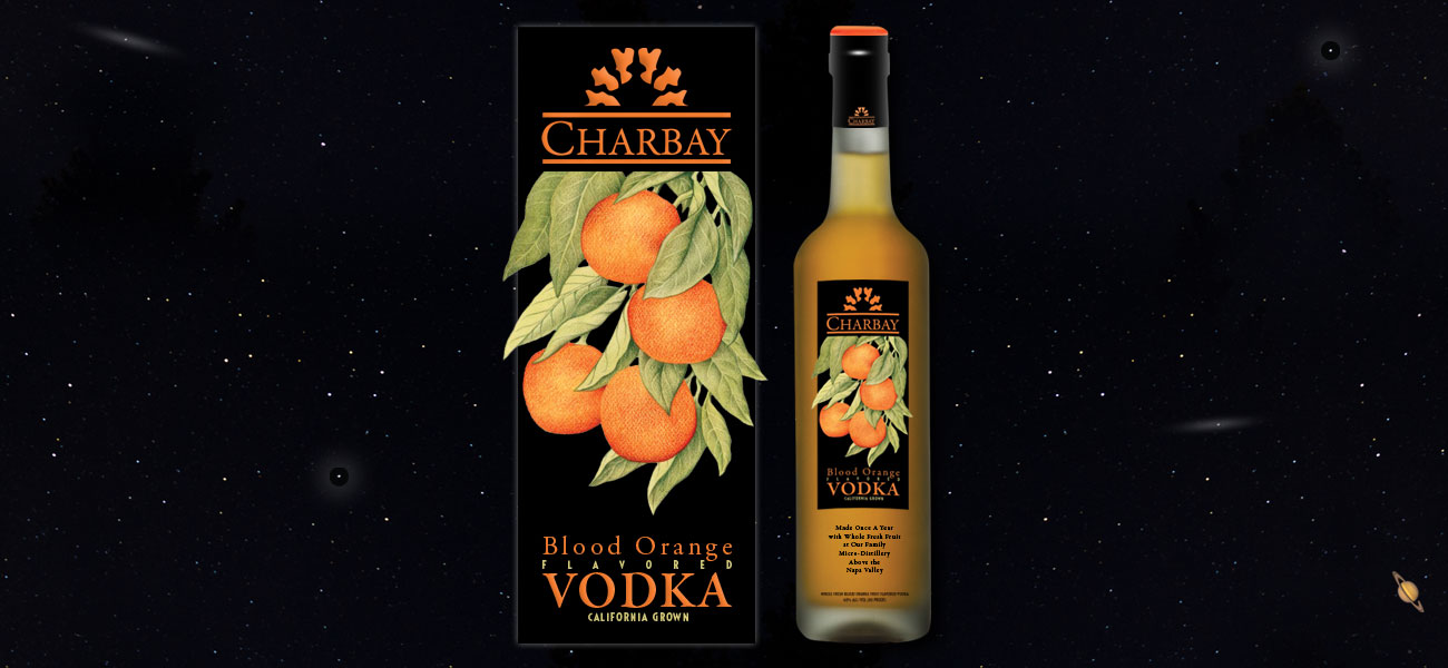
Charbay Premium Vodkas:
Many years ago I got a call from Susan Karakasevic, one of Charbay’s owners. Susan was looking for a new look for their ultra premium fruit infused vodkas. Susan wanted to accentuate freshness and hand crafted production of the family distilled spirits. Our initial presentation was met with enthusiasm. Unfortunately, the design never made it to market. It still looks pretty great to me, thanks, in no small part, to Tom Hennessy’s superb illustration.
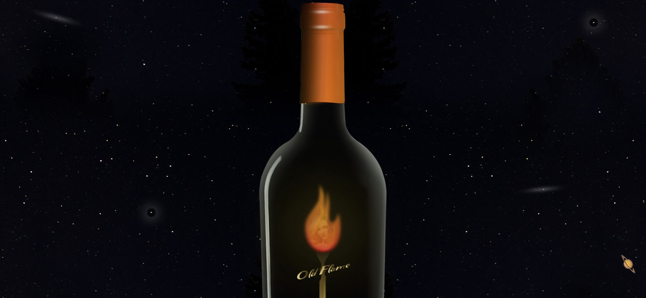
Old Flame:
This idea seemed like a perfect fit for an ultra premium Cabernet Sauvignon. It is mysterious and romantic. The perfect bottle to share with your partner on a special occasion.
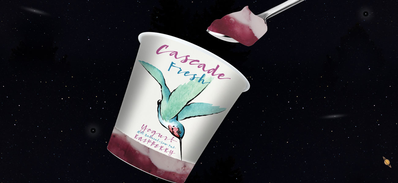
Cascade Fresh:
Two former (early days) Microsoft employees wanted to flea their high tech beginnings. They bought a well established Seattle dairy and yogurt brand called Cascade Fresh. I was asked to create a look that was entirely different than anything in a grocer’s dairy case. My clients both loved this approach and approved it. As things worked out in the real world, one of Cascade Fresh’s largest buyers, a Seattle based grocer, didn’t like the packaging. That’s all it takes to kill a new idea.
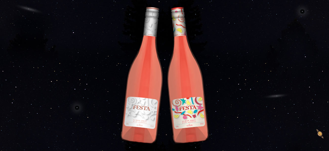
Scotto Cellars:
Thanks to my friend Karen Mancuso, owner of Mancuso Wine Brokerage, a fun project came my way for a new beverage category. This zesty, low alcohol rosé and lemon wine is directed at younger demographics with women being the primary target. I came up with the brand name: Festa. I wanted to make it fun and lively. Sadly, we didn’t get a thumbs up.
Project Highlights
- More client branding / design projects
- Early presentation designs
- Self-promotion pieces for marketing events
- All concepts were fully simulated and developed
Date
2016