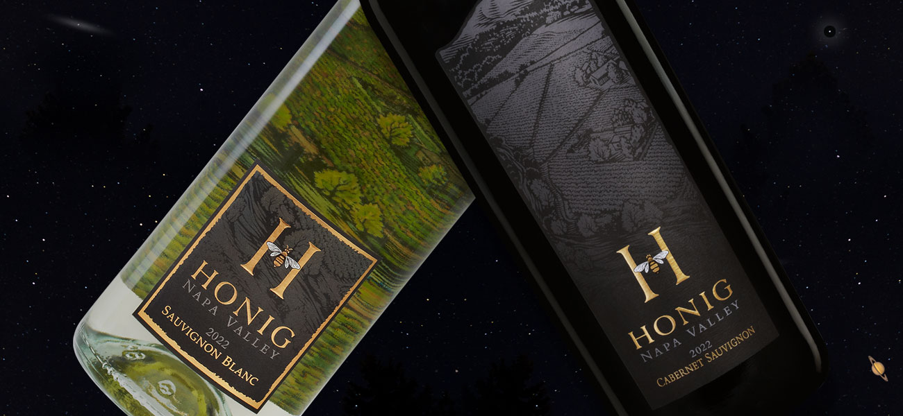
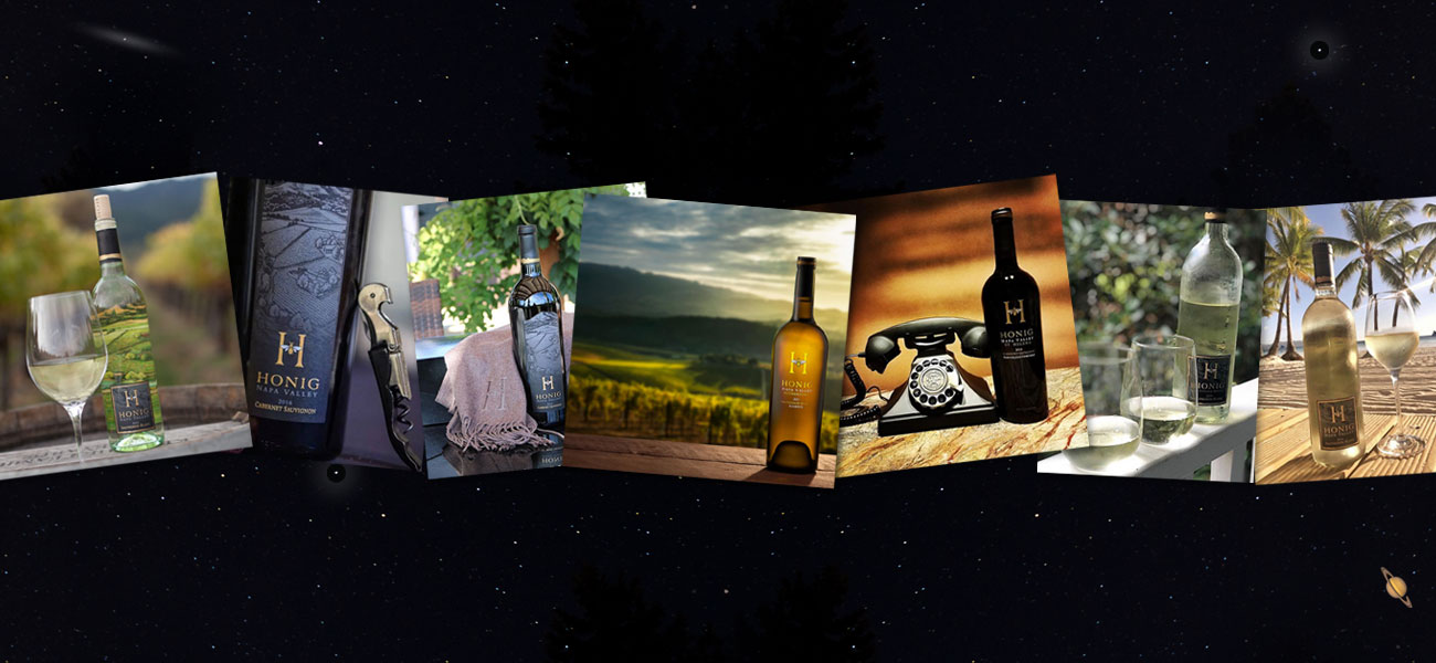
Regina Weinstein, Honig’s Director of Marketing, knew what she wanted. The project began as a “design refresh” but when our process was over, we ended-up with an entirely new look. Honig’s standing design was strong but a little too abstract. Regina’s objective was to add visuals that were linked directly to Honig’s winery in Rutherford. We were also looking for more brand continuity throughout their portfolio.
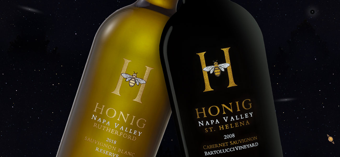
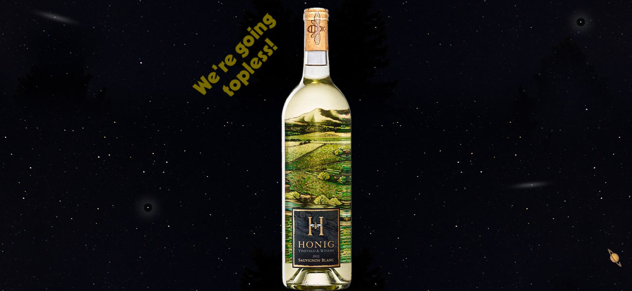
I suggested abandoning a vague vineyard illustration on their standing package. We commissioned illustrator Tom Hennessy to capture the property from above, showing the vineyard in the middle of Rutherford with Mt. St. Helena in the background. I asked Tom to do two versions; one in black line work for the Cabernet Sauvignon label and another color version for Honig’s very popular Sauvignon Blanc.
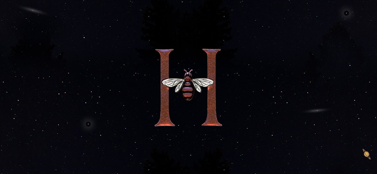
I moved Honig’s handsome logo to the front label. It made the “H” and bee the focal point and strongly branded each label. This enhanced visual element provided the glue that stitched the package (and their entire portfolio) together. Gold foil and multi-level embossing make it the star. Honig’s three reserve wines were also redesigned as silk-screen applications prominently showing the enhanced “H” and bee icon.
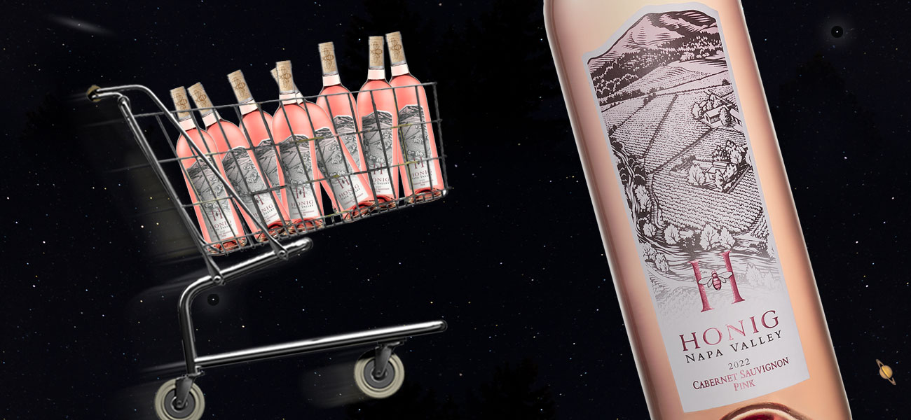
In late 2023 Regina wanted to move their Cabernet Sauvignon Rosé (Cab Pink) label from black to white. The flipped color scheme worked perfectly and better expressed the crispness and brightness of the Rosé.
Honig’s estate wines and the single vineyard reserve wines were awarded medals by the San Francisco International Wine Label Competition.
Project Highlights
- Six new label suites
- Three foil and embossing treatments
- Three silk-screened reserve packages
- Paper selection process
- Multiple on-site press checks
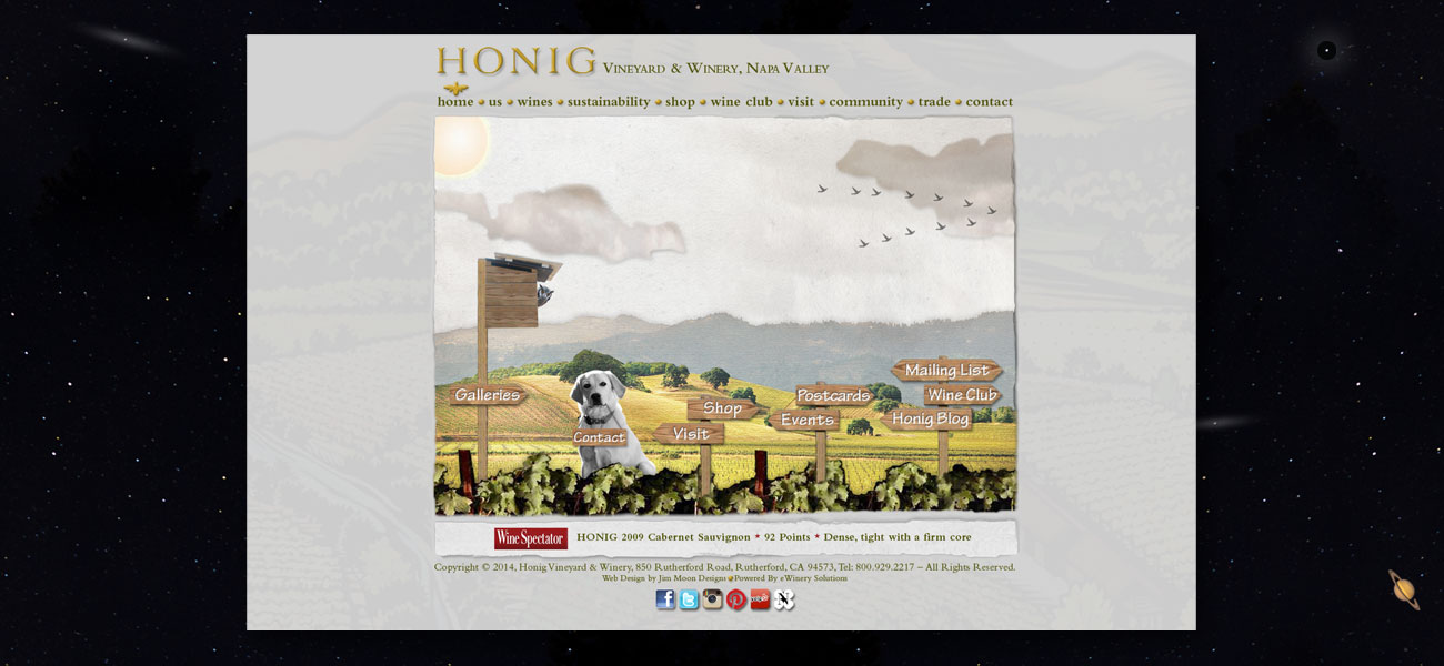
- Designed Honig’s 65 page custom website
Date
2016