15 Jun Honig’s Website: The Deep End of the Pool!
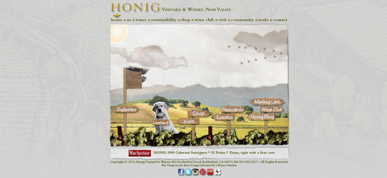
Regina Weinstien, Honig’s Director of Marketing & Retail, and I were having lunch, commemorating the completion of Honig’s new package design project. Out of the blue Regina asked me if I would be interested in “refreshing” their website. We went back to the winery and dove in.
Designing vs. Coding:
I have designed websites. By design I mean just that. I did not know how to write code. That takes back-end implementation professionals. Fortunately, Regina already had a relationship with eWinery Solutions, one of the Napa Valley’s early website builders and interactive specialists. Together, we brought the new site to life.
Questions and More Questions:
Defining the scope of the project was no easy task. I asked Regina to complete a questionnaire which sought to determine precisely where a new site would go; what do we need to retain, what new features are we looking for, will new photography will be required, in other words, we wanted to nail down every single detail.
 I knew this was going to be a design refresh. Regina wanted to retain the look and feel of Honig’s existing site. We hit a few roadblocks right away. First, we did not have the Photoshop files that built the original site. Without them we could not upgrade page layouts or drag over visual components we wanted to retain. The design refresh quickly morphed into a completely new page-by-page Photoshop rebuild.
The original Honig site was still used Adobe Flash. Many pages would not run on Apple iPhones, iPads or other new mobile devices. It became clear that while we would retain some visual fragments of the original site, every single page would need to have mobile device functionality.
Sixty-Five Pages Later:
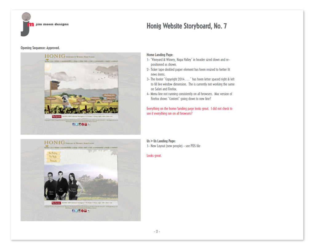
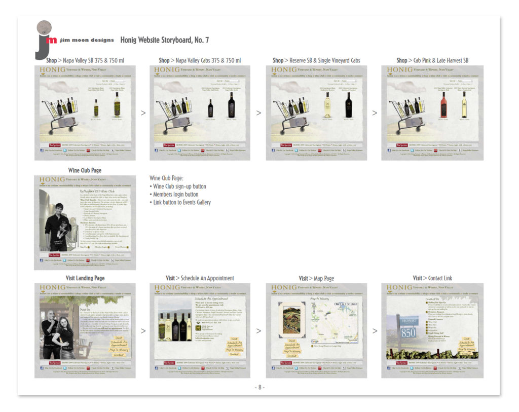
After months of back and forth and new layouts, we turned the project over to eWinery Solutions for implementation. I created a page-by-page storyboard of the entire site in Adobe InDesign which I output as a PDF. The storyboard not only previewed each approved page but also indicated its’ functionality and path within the site. The storyboard also had input fields for corrections and revisions. It provided a clear path for both eWinery Solutions and Hoing to track changes and priorities as we moved through the project. We all knew what we wanted each page to look like and what we wanted it to do.
 Go To: www.honigwine.com
Judging from visitor feedback, the site has been well received. Find out for yourself. Websites are perishable and change with the speed of lightening.
