24 Jun How to Differentiate Your Family Members:
Wineries want to create points of difference with their core and reserve wines. At the same time, there needs to be a measure of continuity between the two. Reserve wines, obviously, need to look more up-scale to reflect their elevated price points. Marketing people refer to this as “positioning.” Below find three examples.
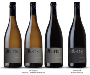 Iris Vineyards, Eugene, Oregon:
Located in Eugene, Oregon, just south of the Willamette Valley AVA, Iris Vineyards is a small producer of Pinot Noir and Pinot Gris wines. We recently elevated the package design to reflect a more formal look and feel. The estate labels were embossed with both black and gold foils. The overall texture of the stock was accentuated with a multi-level embossed treatment to add more depth and dimension. The tooling costs for all the dies were considerable.
We knew that a reserve Pinot Noir was coming. Instead of designing a new look, I decided to keep the same layout. Instead, I changed the background color to a darker gray value. I also changed the color of the foils in the Iris icon. The result gave us the differentiation we were looking for. At the same time we avoided new tooling costs. We repurposed all the original dies. There is nothing wrong with saving money. Clients, as a general rule, like that.
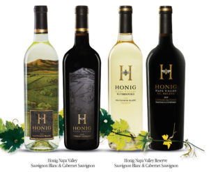 Honig Vineyard & Winery, Rutherford, Napa Valley:
The labels we were replacing did not show the Honig “H and Bee” icon on the face labels. When I visited the winery the “H and Bee” icon was all over the property. I thought it was striking and distinctive. One of my first priorities was to place it front and center on all face labels.
I knew from the beginning that we were going to use paper labels on the Napa Valley core wines; Honig’s popular Sauvignon Blanc and Cabernet Sauvignon. The previous reserve wines were also paper labels with type treatments only. From a distance, it was difficult to distinguish the higher price point wines. I proposed a silk-screen solution for the Rutherford Sauvignon Blanc Reserve and the single vineyard Cabernet Sauvignons. The “H and Bee” icon provided the continuity we were looking for to tie the portfolio together.
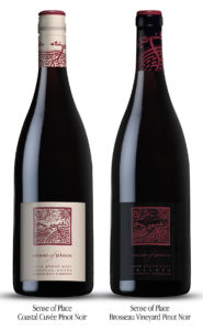 Sense of Place, Carmel, California:
Keeping wines at different price tiers can be tricky. You want to carry over the design so there is no mistaken identity. There are also production costs to consider. Sense of Place is a small producer of fine Pinot Noir in the Monterey County AVA. Their premium Pinot Noir is a single vineyard wine that needed to express a higher price point. The lower price point Coastal Cuvée Pinot Noir needed to have stature but also distance itself from the Brosseau Vineyard wine.
The solution followed the Iris Vineyard approach. We kept all the same embossing dies and made a distinct color change on the labels. In addition, we made clear color changes in the capsule treatments. We got the distinction and the price point differentiation while keeping it all in the family.