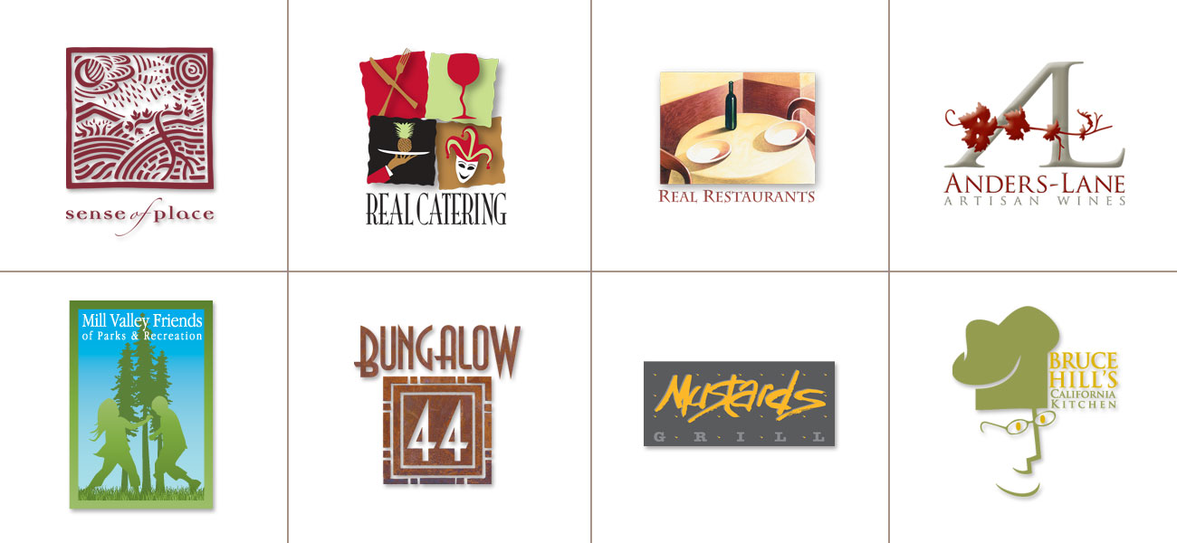
23 Jun Logo Design: A Tough Nut to Crack!
Anyone with a digital device is now capable of knocking-out a logo. Google an image, distort it, add color – done. That might be okay if you have low expectations. In my world, designing a memorable icon requires focus and determination.
Consider a Logo’s Lifespan:
An ad, pamphlet or marketing email might have an expiration date of a few seconds or more. Logos, on the other hand, often last for decades or maybe the entire life of a business. They appear on every element in the client’s marketing mix, including packaging. That’s why a logo design commands a higher fee level – it is based on extended usage.
Logos are shorthand symbols for everything a client wants to say about their respective business, including their vision and mission statement. That’s an awful lot to ask for one visual component.
There are hard-wired realities; it can’t be too busy or eyes will look elsewhere. It can’t be too stiff or boring because it will be invisible. It needs to capture attention and communicate a story. That is a tall order and a difficult target to hit.
Know Your Limitations:
I am NOT an illustrator. I am a designer. I have my strengths but I know where they dead-end. If I think an idea could be better expressed in the hands of an illustrator, why not involve their skills. Chances are, they will get you to the destination a lot sooner and the finished product will be the better for it. I build an illustrator option into every one of my logo design proposals. That illustrator is always going to be my buddy and collaborator, Tom Hennessy.
Listen Closely:
I have found that if I listen, really listen, clients will lead me to their target. I ask for visual reference – the more, the better. I listen for details in their stories. I urge them to tell me what they liked on my website. I visit wine departments and ask clients to tell me which packages catch their eye. All of this helps me determine a “comfort level.” Finding a visual preference for a logo is a lot like selecting one’s wardrobe. You might like something in a store but would you “wear” it?
Be Patient:
Obviously, some clients are more visual than others. Less visual clients typically need to be shown highly developed ideas and concepts. They may not be able to fill in the blanks if a comp is too loose or unformed. Visual people get it . . . they see a direction and understand where you are going. The sooner you recognize a given client’s visual capabilities, adjustments can be made.
Satisfaction:
It always feels good when you arrive at the target. I am looking for the “I love it” response. Anything less doesn’t feel right. I don’t want a client to “settle” or compromise on something so important. I want a logo (or a wine label) to last a lifetime.
