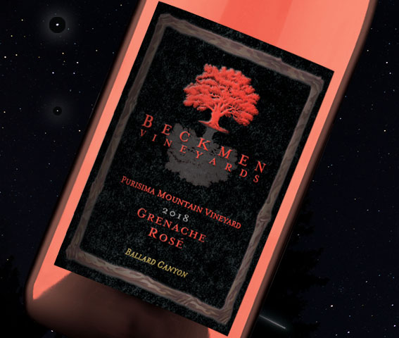


Waterstone Wine Group grew out of an earlier Anders-Lane Artisan Wines partnership (Brent Shortridge and Philip Zorn) that included Ceviche Sauvignon Blanc, Z-52 Old Vine Zinfandel and Bucatini Red Wine Blend. Each wine was a silk-screen execution that pushed the limits of what could be placed on a wine bottle. All three packages won wine label competitions for design excellence.
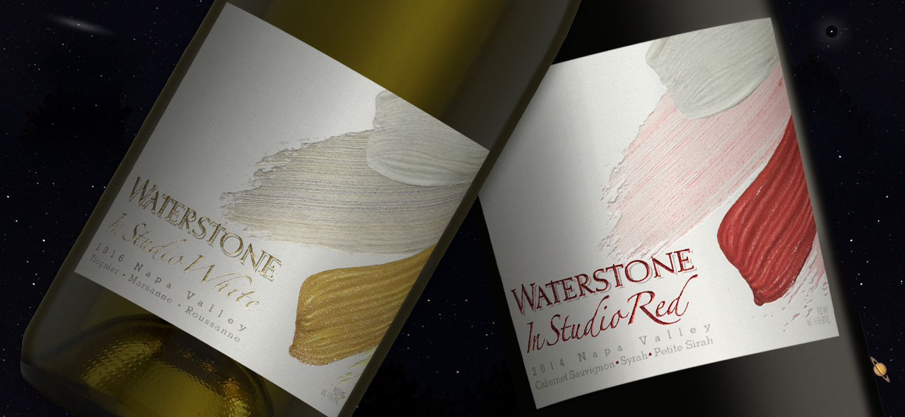
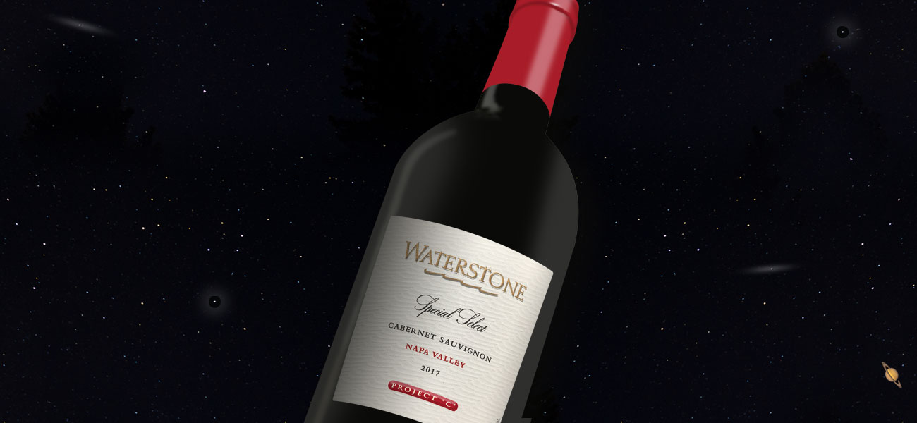
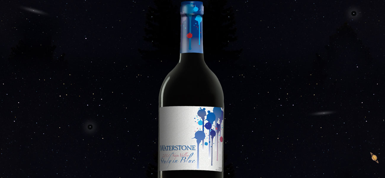
Brent Shortridge’s objective with the Waterstone brand was to create “Affordable luxury wines from the Napa Valley.” The wines were balanced, earnest expressions of the grapes and terroir from which they came. With this reputation in mind I was asked to create premium tier package designs for blend wines called In Studio and Study in Blue.
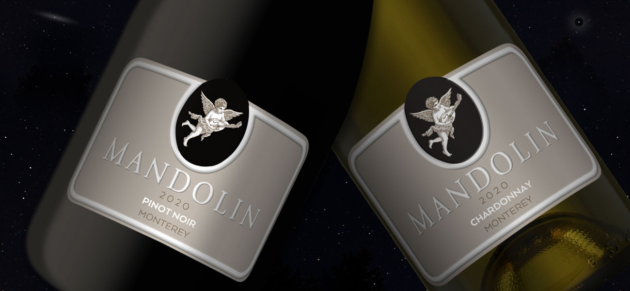
Brent wanted to create a distinctive look that would elevate the brands within the Waterstone portfolio. For me, the blend’s names, In Studio, Study in Blue and Study in Red established the direction. How could we visually express the varietal content of each blend in a pleasing way? Paint brush strokes and drippings captured each wine’s complexity and visual tone. Waterstone’s Mandolin brand was also redesigned and elevated.
Together with compatible capsule treatments, the designs were approved. They visually linked to Waterstone’s standing labels. At the same time, they expressed their own respective identities.
Brent Shortridge continues to grow Waterstone Wines with new concepts and market entries. I look forward to unfolding these projects.
Project Highlights
- Designed Waterstone’s premium blend wines
- Reflected Waterstone’s standing branding
- Redesigned Waterstone’s Mandolin brand
- Provided all print and capsule project management
Date
2016