07 Jul Shedding Light On Dark Labels
By Jane Firstenfeld, W&V’s Senior Editor
I very much appreciated contributing to Jane Firstenfeld’s article on trending label design story. The use of black in labels has its ups and downs. Jane talks about it in depth, as she usually does when she focuses her attention on a packaging topic.
Here Is An Excerpt:
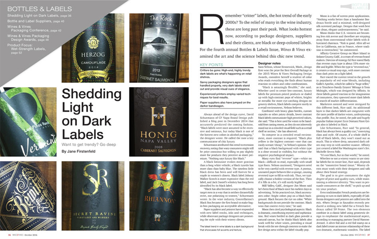
Mill Valley, California designer Jim Moon said he’s been fond of black since his earliest days in advertising. To his practiced eye, black accentuates color: Bright colors pop on a black background. Black focuses the eye on color. “White backgrounds do not provide contrast. Black wins that contest every time,” he said.
 Moon then cited psychological aspects: Black is dramatic, contributing mystery and sophistication. Red wines in dark glass provide a natural canvas, but he thinks black labels also work well with white wines, providing a visual break with the see-through contents to make the live design area within the label visually pop.
Moon is fan of screen-print applications. “Nothing works better than a handsome Bordeaux bottle and a minimal, well-designed silk-screened package. Designs that work best are clean, elegant understatements,” he said.
Moon thinks that U.S. vintners are becoming less risk averse and therefore are stepping away from conventional white labels with an illustrated chateaux. “Risk is good. After all, we live in California, not in France, where tradition is entrenched,” he commented.
