23 Jun Labeling An Iconic Landscape
It caught my eye. First a glimpse, but then I was transfixed … an iconic landscape, right here at the checkout line of my local Whole Foods Market.
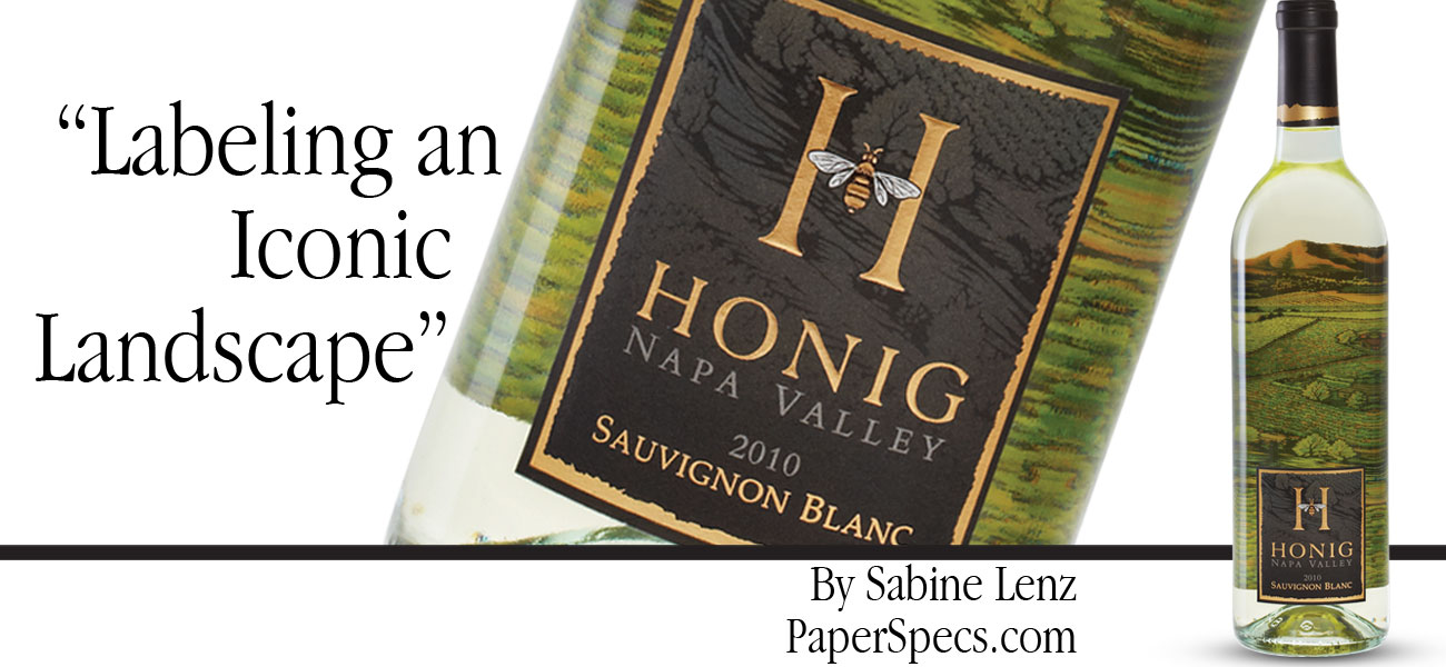
I was looking THROUGH the clear glass at the front of a wine bottle to view what can only be described as a realistic depiction of the Napa’s rolling hills at the back of the bottle – as if I was looking through a window out onto the vineyard.
The effect of the neatly lined up bottles of Honig Vineyard’s 2011 Sauvignon Blanc was stunning. My first thought: This is not your average wine label. My next thought: I have to find out how this was done.
Refreshing Brands
Last year, Honig Vineyard undertook a complete overhaul of its wine labels. The company always had a flair for outstanding design and marketing, but wanted something new and fresh, while at the same time, staying true to its branding.
“Customers have so many choices these days,” explains Regina Weinstein, marketing director at Honig Winery, “and if they are not familiar with a particular region or winery, the label and packaging must catch their attention.”
With the help of designer Jim Moon, of Jim Moon Designs, Honig did just that and a whole lot more.
“As a general rule, wineries seldom walk away from existing branding. They want to retain as much on-the-shelf recognition as possible. So from a design perspective, it’s always a challenge to retain a visual component and also create a refreshed look and feel,” explains Moon.
To refresh without destroying Honig’s identity, Moon focused first on the logo. “Honig has a very strong icon that in my opinion was under-emphasized. I suggested that we use their icon (the capital H and Bee) to give us graphic continuity.”
A Sense of Place
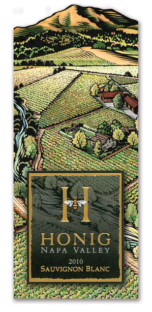
To further develop an emotional connection between the wine and the consumer, Honig and Moon decided to use a landscape on the back label as a visual link.
“We wanted to give our customers a sense of place,” says Weinstein. “A feel for the Napa landscape and more so of our winery. The colorful illustration on the front of the back label is actually a rendition of our vineyard.”
This brings me back to what caught my attention in the first place – that back label. How could the label be printed on the glued side? Was the bottle itself printed?
No Simple Feat
The short answer is, “No.” The back label is printed in four-color process on 60 lb. Classic Crest Text sheets then diecut. (The waved shape of the diecut at the top was planned to enhance the Napa rolling hills feel.)
But this is just where the story gets interesting. Typically, there are two ways to print paper wine labels – flat conventional press sheets, which are printed, diecut and glued to the bottle or pressure sensitive labels, which are essentially printed on self-adhesive rolls mounted to a peel-away backing.
“There was only one way we could achieve the viewing-through-the-bottle effect we wanted for Honig’s Sauvignon Blanc,” says Moon.
“We had to adjust our complete bottling system,” explains Weinstein. “We tested various glues and finally found one that allowed the picture that would touch the bottle to stay clear and the label to adhere perfectly.”
Keeping the thickness of the glue uniform is important – too much glue will bubble the label, too little will not adhere the label properly.
It’s also important that the glue remains transparent and not impact the color of the inside back label, particularly important here because too much glue could muddy the image being viewed through the bottle.
On the Face of It
While the back label is the star of the bottle, the details and thought that went into the smaller face label (the label that goes on the front of the bottle) are not to be missed.
The face label had to be big enough to showcase the winery name and vintage, and yet small enough to allow the landscape label on the other side of the bottle to shine through.
At first glance, the palette appears to be a simple rendition of two colors plus foil, but this is not the case. Several options were discussed and tried to achieve the resulting subtle tone-on-tone effect.
“We tested various combinations starting with a tri-tone effect,” explains Lisa Haro of Collotype Labels in Sonoma, who printed the labels. “But the Honig Winery wanted a very specific muted look – one that would give the impression of looking through a picture window onto the vineyard bathed in moonlight.”
They accomplished it this way:
1- Four-color process to create the dark background in the landscape detail
2 – A double hit of black for the outside frame,
3 – PMS 423 gray for the lighter part of the landscape detail as well as the vintage name, gold foil stamping on the type, inside frame and bee,
4 – Then in a separate press pass, another hit of black was added on top of the gold foil bee to emphasize the bee’s wings and body details.
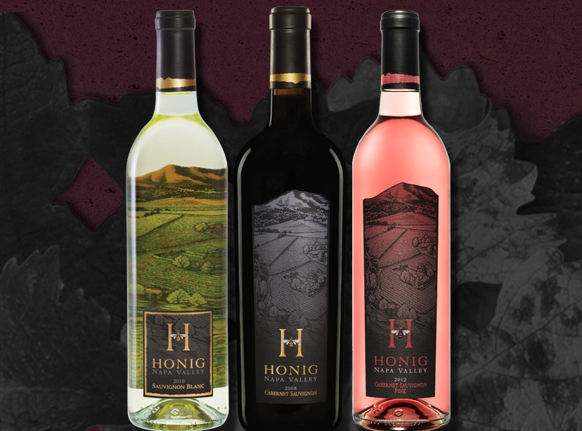
5 – The use of black on the face label also links to the Napa Valley Cabernet Sauvignon and Cabernet Sauvignon Pink varietals, which feature the same vineyard illustration but in moonlight and sunrise renditions respectively.
Label Endurance
It’s pretty easy to see how important a good wine label stock is. It has to be a workhorse. Honig’s Sauvignon Blanc label is embellished with multiple hits of color, foil, embossing, a graphic coating, and then glued to the bottle.
After that, it’s shipped in cases where it rotates against cardboard baffles, jostled by warehouse forklifts, retailers and restaurant employees only to end up in a wet, cold ice bucket.
That’s a lot to ask from any piece of paper as it is from the skilled printers that make it all happen.
Pouring Their Hearts Into It
Slight adjustments have been made to the original label designs now in their second vintage year. “I think most wine consumers would be astonished by the amount of detail and consternation that goes into these tiny paper labels,” muses Moon.
“Honig was willing to invest the time and expense to press proof each of their labels,” Moon commends. “Not many clients are willing to trigger such an exercise. Believe me, there is not one molecule we didn’t examine under the microscope.”
Why? Honig’s Napa Valley Sauvignon Blanc is its trademark wine – highly regarded by wine writers and the vineyard’s number-one seller across the country. Hence, the importance of getting every detail right.
The amazing results of these superbly crafted and well-planned labels speak volumes about all involved with the Honig brand.
The winery produced 50,000 cases of the 2011 Sauvignon Blanc that originally caught my attention. Even if you’re not a wine connoisseur, keep your eyes open and get your hands on a bottle of this special wine.
Go To: http://www.paperspecs.com/paper-news/labeling-an-iconic-landscape/


