24 Jun My Favorite Rejections!
I would like to able to tell you that every one of my designs was approved at the first presentation. That’s not the way it works. In most instances, it is a process of give and take. Together, we are trying to find just the right fit . . . something that feels comfortable.
I almost always create something that is outside the box with other more planned design solutions. Every once in a while a wild card wins. Most of these “wild cards” are parked on back-up hard drives and homeless. Here are a few of my favorites.
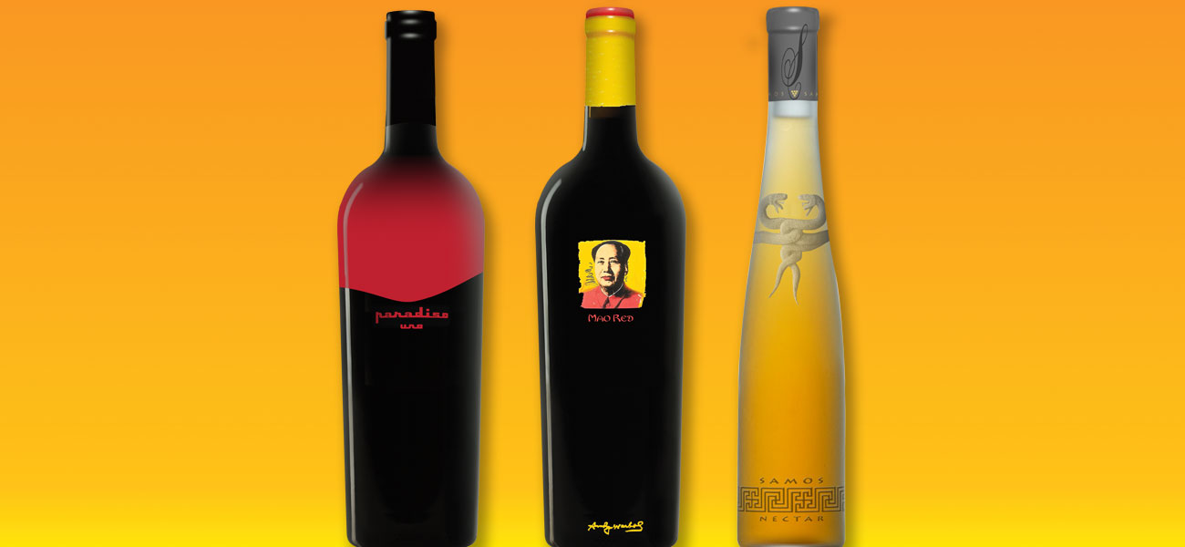
Contemporary Italian:
I was asked by Ledson Vineyards in Kenwood to create new branding for their ultra premium wines. Each single vineyard release would be offered to their wine club membership. The look and feel was to be classic Italian.
At the same time I had just learned about a new wine bottle silk-screening process. Decoration, I was told, could now be applied to the neck and shoulders of each bottle. With this process in mind I thought about one of the most classic Italians of all time, the 1964 Ferrari 330 GT 2+2. This is what my fantasy looked like on the bottle.
Cheers to Andy Warhol & Chairman Mao!
Many years ago, Carl Doumani (former owner of Stags’ Leap Winery, Benton-Lane Winery & Quixote Winery) was negotiating to license an Andy Warhol painting for wine label usage. Carl asked me to get involved. I went to the Warhol achieves and picked my favorite. I also came-up with a brand name: Mao Red. Unfortunately, the project floundered because the parties couldn’t agree about financial terms. I still love the package in spite of its political insensitivity.
Snake Phobia Overcome!
Two Greek dentists from Charlotte, North Carolina wanted to introduce their native country’s high quality dessert wines to American audiences. The look was to be intentionally upscale to distance them from the headache inducing Retsina wines that had poisoned tourists for centuries.
I dug around in ancient history books and found wonderful old drawings of Greek temples and architectural elements. When I landed on the intertwined serpents I thought I had something. Unfortunately, my clients didn’t share my enthusiasm. I still like it . . . besides, they look like happy snakes to me.
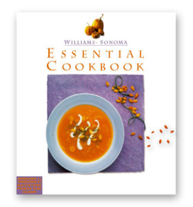 Williams-Sonoma: Clutter in the Kitchen!
Many, many years ago I was asked to design the cover of a W-S cookbook and DVD package. It was my first “corporate” experience with all the trimmings. There were panels of deciders. Once the deciders, decided, focus groups were called in.
This was one of early presentations. It was clean and simple. I loved the colors. I was particularly fond of the pumpkin seeds resting on white space. It still makes me happy. What ended-up getting printed was exactly the opposite. It was a busy clutter of food components that appealed to every person in the chain of command . . . too many cooks in the kitchen.
I remind myself on every project that each new design isn’t about what I like. Keeping me happy, when it’s the client’s money, is the last priority. That said, I am entitled to my favorites.