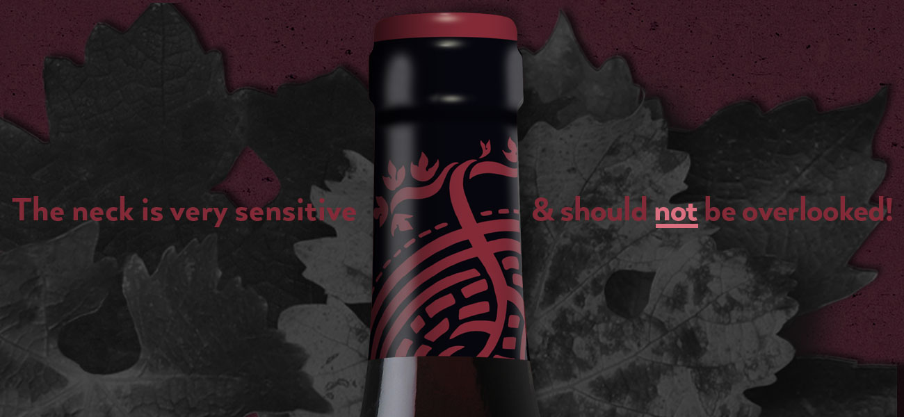
27 Jun The Neck Is Very Sensitive!
I have this thing for capsule treatments. It goes way back. The label is the hero of the package. But why overlook the supporting actor? Together, they raise the entire presentation.
Given what can be achieved on capsules today, capsules can play a significant role in capturing attention on the shelf. Given a wine package’s small amount of visual real estate, no square inch should be overlooked.
 Accentuate the Branding:
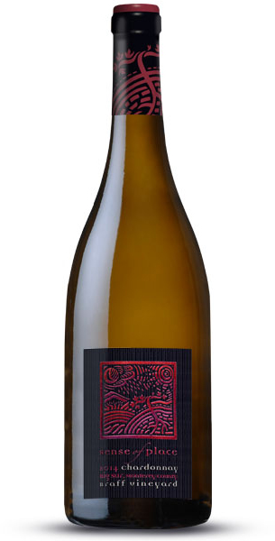
A lot of time and focus went into the Sense of Place face label icon. Leslie Bowlus, the winery’s owner, asked me to graphically define “terroir.” Terroir is that fuzzy French term that describes all the forces that influence the vines like, geography, climate, the moon and the stars. She provided plenty of visual reference along with detailed descriptions of her expectations. It helped narrow the possibilities. Leslie’s visual reference did just that and we hit the target on the second presentation.
Together with collaborator and illustrator Tom Hennessy, we were able to express “terroir” as an intriguing graphic. I wanted to take it a step further and capture it on the capsule. I didn’t want to overpower the label – just lift it slightly to complement the entire package.
Capsules are not like labels. They cannot be precisely placed on a bottle. The graphics on capsule have not front or back – the design has to work for 360 degrees. With this in mind, I had to make Tom Hennessy’s illustration work as a 3D object. I isolated one of the grape vines and figured how to seam it together.
Selecting the Right Vendor:
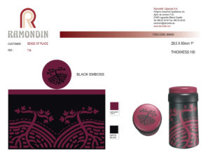
I recommended that we give the job to Ramondin USA, the Spanish capsule manufacturer, who has long been my preferred premium quality foil vendor. They have perfected silk-screening on tin to the point where they won’t tell you how they do it. It’s a trade secret. Their screening stations are so precise they can be depended upon to capture the most complex designs. They also lay down different ink values from high gloss to matte finishes. The foil cap (top) can also be embossed and screened with multiple passes of color. All of these executions end-up making the finished product look like a jewel once it is applied on the bottle.
 Ramondin has perfected their proofing process by providing perfect 3D simulations. PDF files give you and your client a 360 degree look at the finished product. If you are worried about what the left and right seams will look like – the proofs will show you. If an adjustment is required, they make the change and send you a new PDF. Once proofs are signed-off, there will be no surprises.
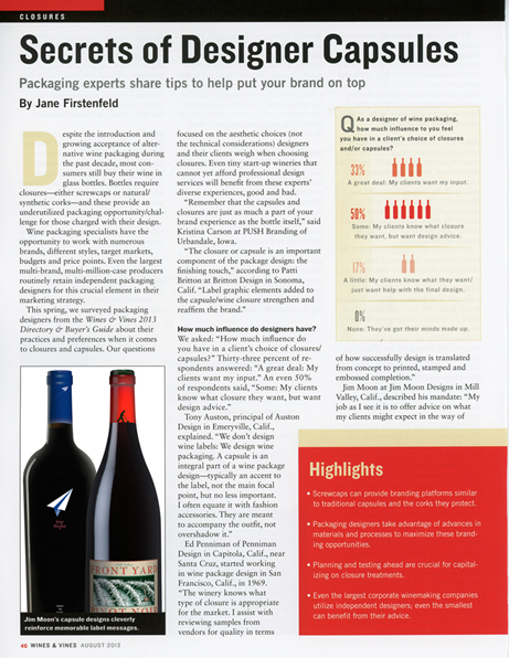
I contributed to a “Wines & Vines” article by Jane Firstenfeld entitled “Secrets of Designer Capsules.” Here is an excerpt:
Jim Moon at Jim Moon Designs in Mill Valley, Calif., described his mandate: “My job as I see it is to offer advice on what my clients might expect in the way of design reproduction from a given capsule manufacturer. “I believe that the capsule/closure treatment is a major contributor to the success of a package design. When reproduced faithfully, a well executed and designed capsule can add just the right accent to lift the entire package presentation.”