09 Jul On Press It’s Redemption Day!
I was asked by my client Leslie Bowlus, the owner of Sense of Place Wines, to brighten up her Pinot Noir and Chardonnay labels. She wanted to create more contrast for her icon and add more pop to the labels overall. At the same time we wanted to maintain and elevate, if we could, the premium price point positioning of her brand which we designed two years ago.
Threading A Very Tiny Needle
This exercise can be a tiny needle to thread. Leslie’s wines and labels already expressed quality. They were embossed and foiled. I had to do a fair amount of tinkering and musing to try and pull things off. In the end, a lot of small adjustments and refinements helped lift the labels AND create more visibility.
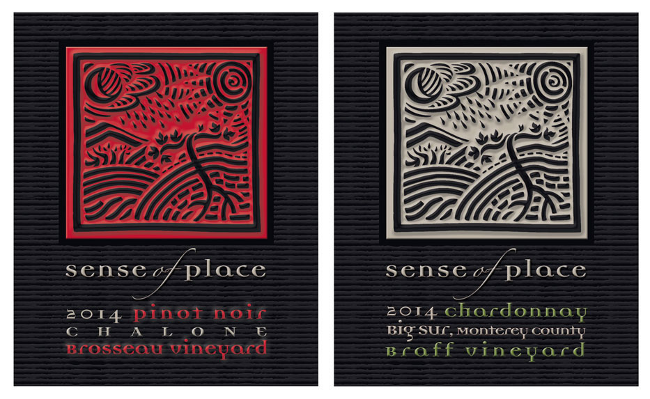 As the Photoshop simulations show, right, texture and dimension were added to the background. I also added a red background behind the Sense of Place icon. Double hits of red were specified to enrich the color. The icon itself was satin black foiled. Silver foil was laid down in the Sense of Place letter forms. Each graphic component was considered and elevated for both the Pinot Noir and Chardonnay labels.
The Nitpicking Pays-Off
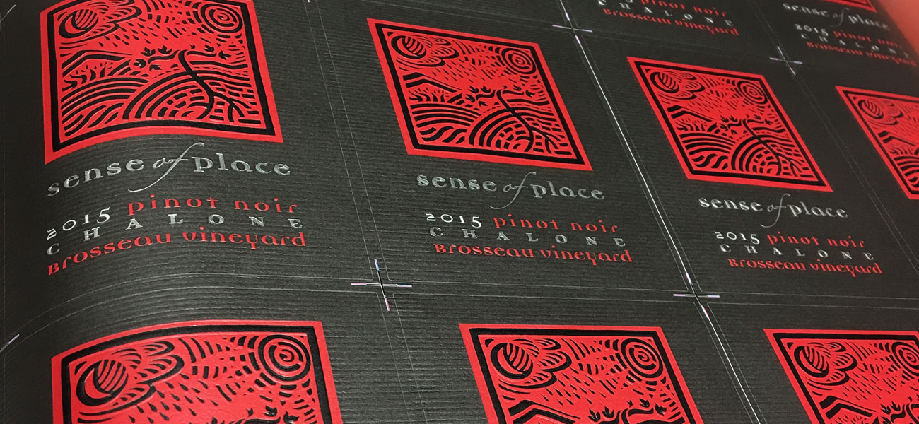
All of these refinements came together at the press check. That’s when you see if all the nitpicking paid off. I congratulate All American Label in Dublin, California for getting us to the finish line. It took a lot of collaboration and professionalism to make it all happen. We were delighted with the outcome.
BTW – All of this got done to meet a very tight bottling line deadline.