02 Aug A Detailed Story About Detail!
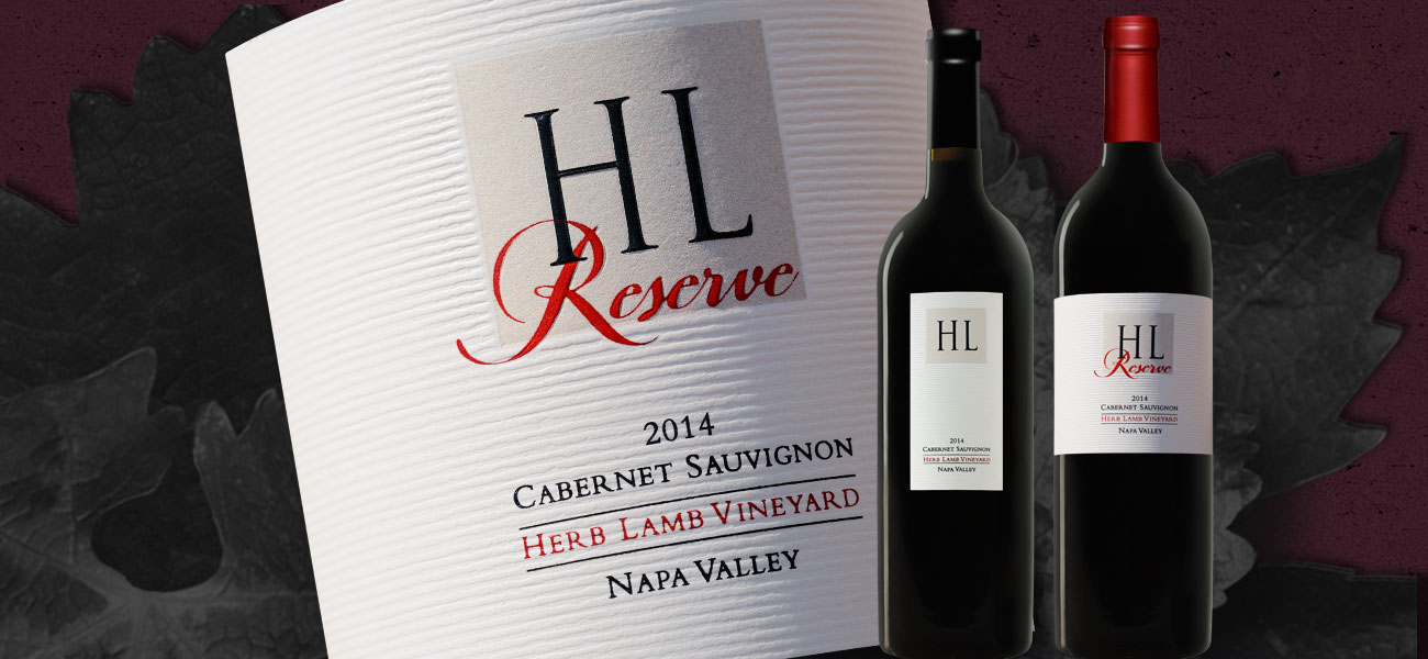
I met Jennifer Lamb, the owner of Herb Lamb Vineyards, at Wine & Vines magazine’s Packaging Conference. Jennifer wanted to raise the bar on her labels for her much sought after single vineyard Cabernet Sauvignon. She also wanted a new reserve label that supported her existing branding.
Incremental Moves
Jennifer made it clear from the start that she only wanted small incremental changes. Assignments like this are challenging. It is difficult to determine what constitutes the “right” amount of change. The first presentation, in my experience, is one way to find out.
I quickly learned that I had over reached. I refocused on subtle shifts in texture and dimension that would elevate the existing simple but distinctive HLV design elements. Both the core Cabernet Sauvignon and the new Reserve Cab are ultra premium wines. As such, both labels needed to express this price tier.
 Four Steps Forward
It’s one thing to present an entirely new idea and quite another to show subtle changes in texture and dimension. Photoshop is a great program but it has limitations when it comes to rendering depth and fine points of distinction. My objective was to present (and sell) an embossing effect – horizontal irregular lines across the background of the label. The HL letter forms would be in a recessed box with a printed buff grainy texture behind them. The “Reserve” element needed to stand out but still allow the HL to be a strong player. Both the “HL” and the “Reserve” would be embossed as well.
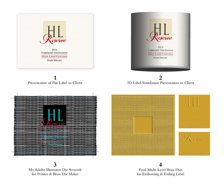
Step 1:
Create the basic label layout and accentuate depth and dimension in each Herb Lamb Vineyard design element. Photoshop’s special effects palette made this happen.
Step 2:
Create a 3D simulation of the flat label. I have an old 3D program I have kept alive on a dedicated computer called Adobe Dimensions. This software will create realistic “wrapped” 3D renderings of any flat artwork. It will realistically wrap and shadow a flat label and enhance texture. Once the 3D version is transferred to a bottle, it looks like a finished design.
Step 3:
Once the concept is approved, which it was, the final two dimensional artwork needs to be rendered in Adobe Illustrator. This line work shows the precise placement of each design element. This digital layout is the starting point and the anchor for the production of all the brass embossing and foil dies. It is also the basis for all printing (digital or lithography).
Step 4:
Each brass die required, left, to create the HLV Reserve label. Three dies were required to produce the maximum depth and dimension of each design element. Three different stations on the finishing press were needed to make all this happen. The background texture and the recessed box required more pressure and heat (Embossing plates are heated to bend and shape paper). The other two dies for the HL and Reserve needed less heat and pressure. The goal is to create the deepest possible impression in the paper without “cracking” the stock.
 This job also had black and red foils, which also required dies. The brass dies shown here only create the embossing effect. The only “printed” elements in this job were the buff texture behind the HL and the vintage date.
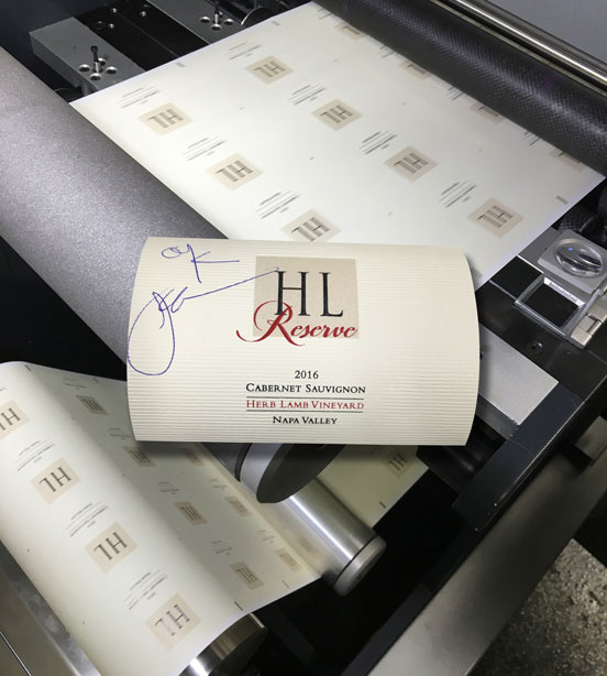
The Press Check
This job absolutely demanded a press check. It was 100% about detail and making sure each step was executed properly. All American Label, in Dublin, CA, made sure that we captured every effect in our playbook.
The finished labels exceeded our expectations.