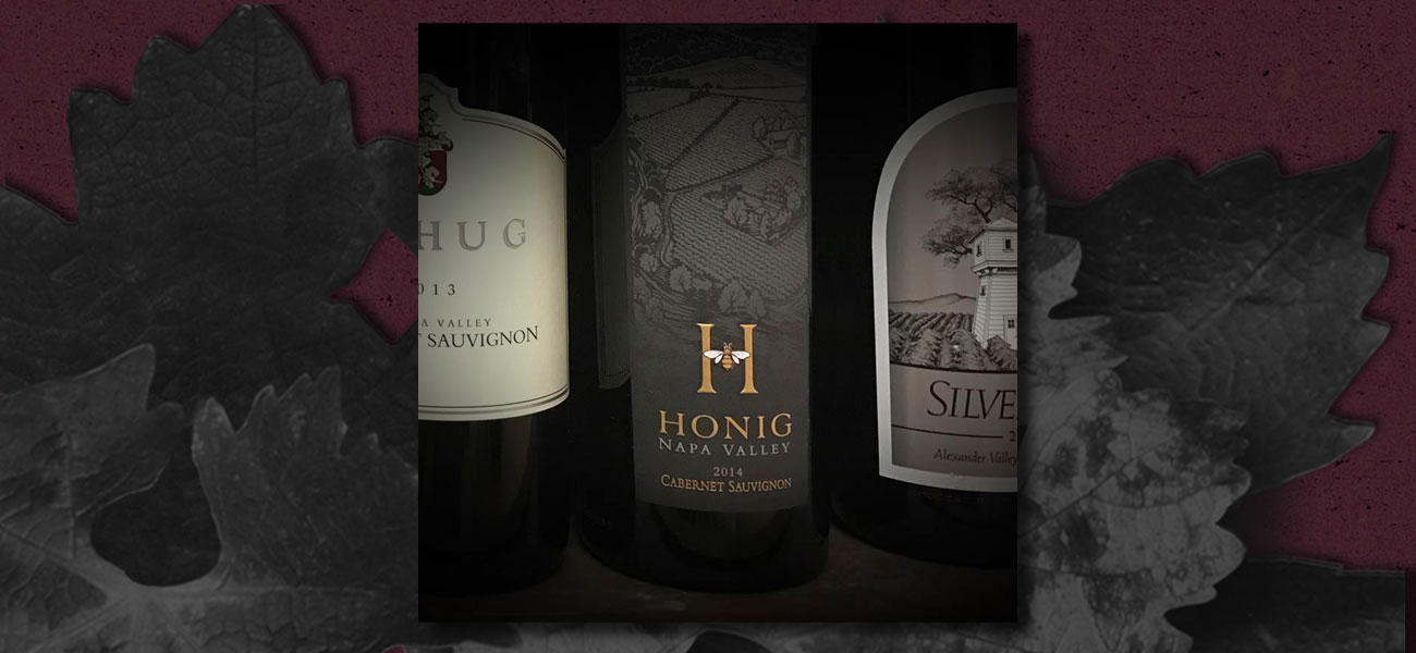
John and Michelle Dimmick were drawn to my website because of my wine packaging background. They were looking for an entirely new look for Maxsea’s product line. For me, it was a new product category and canvas. It’s always exciting to explore new terrain and see what happens....

When my client asked me to create the packaging for a new premium tier for his Waterstone brand, I knew we were going to find interesting visual effects....

For starters, Vicki’s Farm Diva band name is a winner. It was my job to put a face on Ms. Diva. I had other visual references to consider. The product line was estate grown olive oils from the Cressman Ranch in Sonoma....

Jennifer Lamb made it clear from the start that she only wanted small incremental changes. Assignments like this are challenging....

This exercise can be a tiny needle to thread. Leslie’s wines and labels already expressed quality. They were embossed and foiled. I had to do a fair amount of tinkering and musing to try and pull things off....

This poster had a foot in both the old and new world. Back then, digital retouching was nothing short of magic....

Ideas are powerful. Successful brands know this. If there is an added visual cue, some element of the unexpected, it makes a brain implant. It does this, in my opinion, because it entertains....